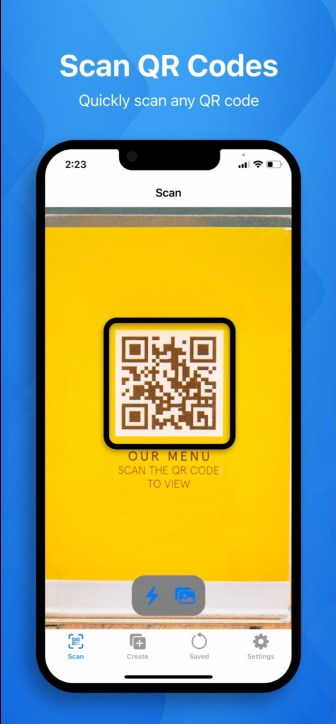
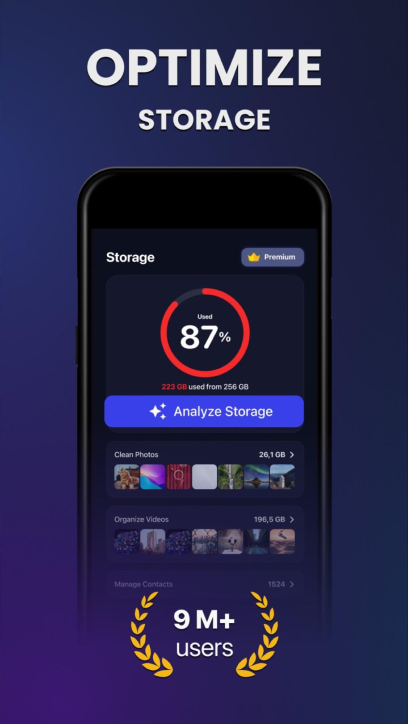
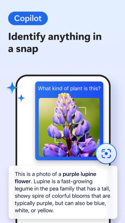
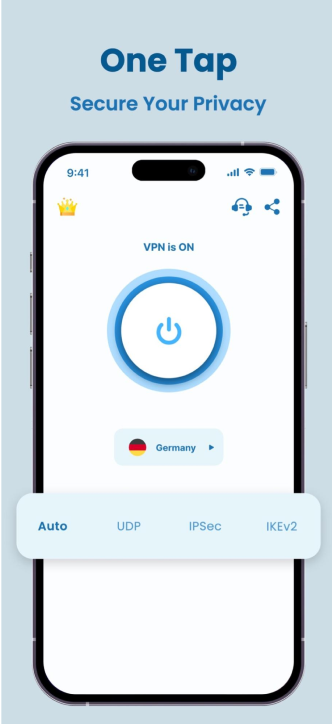
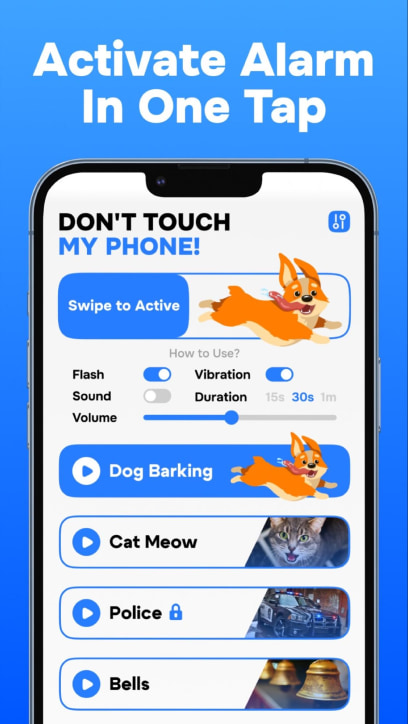
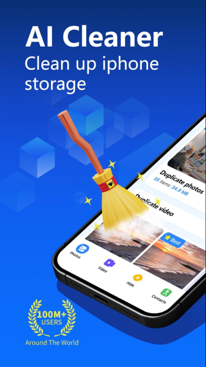
Highlight the main functions of your app in the screenshots to give users a clear idea of what your app offers. Depending on the app’s purpose, some mobile marketers use graphics related to file types or effects (e.g., cleaning effects) to enhance understanding.
Source: the App Store and Google Play
The art of creating screenshots is all about being both useful and engaging. Your task is to craft screenshots that are not only informative but also visually appealing, enticing users to install your app.
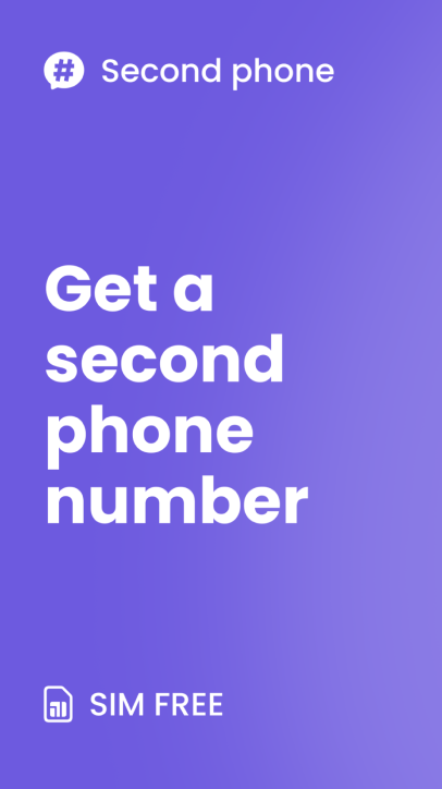
Add short, persuasive captions with clear calls to action to guide users towards downloading the app.
Source: the App Store and Google Play
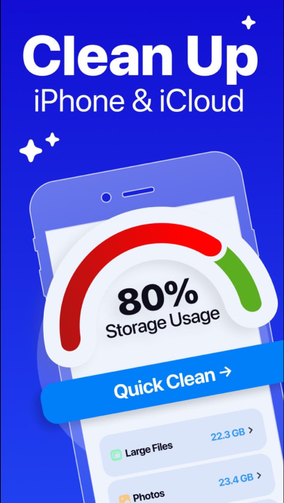
Enhance the appeal of your utility app by emphasizing its simplicity. Add phrases like “in one click” to the captions on your first or second screenshots. Complement these with words like “smart,” “fast,” etc. This strategy can positively influence users’ decision to install your app by highlighting how user-friendly and efficient it is.
Source: the App Store and Google Play
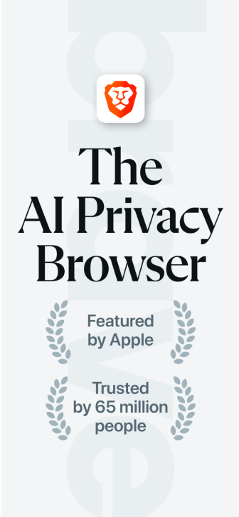
Include testimonials, number of downloads/users or ratings in your screenshots to build credibility with potential users.
Source: the App Store and Google Play
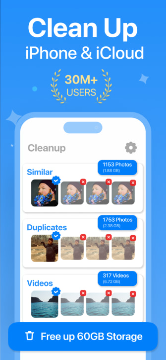
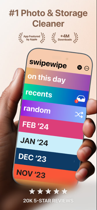
Tip: When designing social proof messages for your app, aim for recognizable and user-intuitive elements. The most effective social proof often includes user count depicted with laurel leaves and a 5-star app rating. Place these messages prominently below the caption on the first screenshot, and ensure they appear in other areas on the first or second screenshots as well.
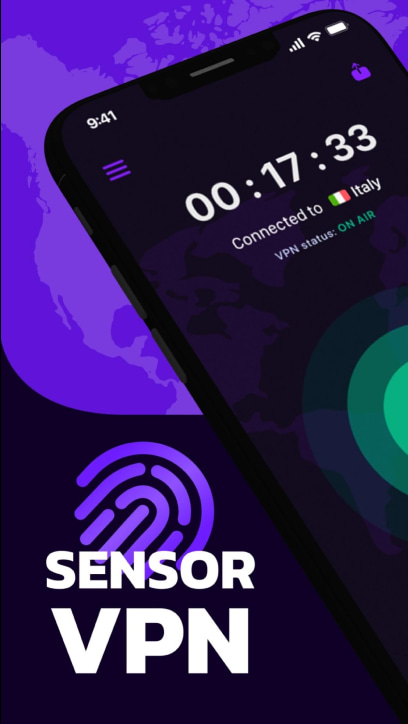
Many publishers use blue tones in screenshots, as they are predominant in the Utility category, particularly for storage cleaning apps. Combining blue with white can effectively convey tidiness and trust.
Source: the App Store and Google Play
While using blue and white tones in your app’s screenshots is a best practice in the Utility category, strictly adhering to these benchmarks can make your app blend in with competitors, potentially reducing its visibility in search results. Consider experimenting with different color schemes to stand out.
Source: the App Store and Google Play
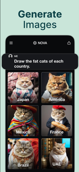
For AI chatbot apps, consider incorporating black and green shades, large headlines with CTAs, and social proof. Emphasize the app’s UI with prompts and bot responses.
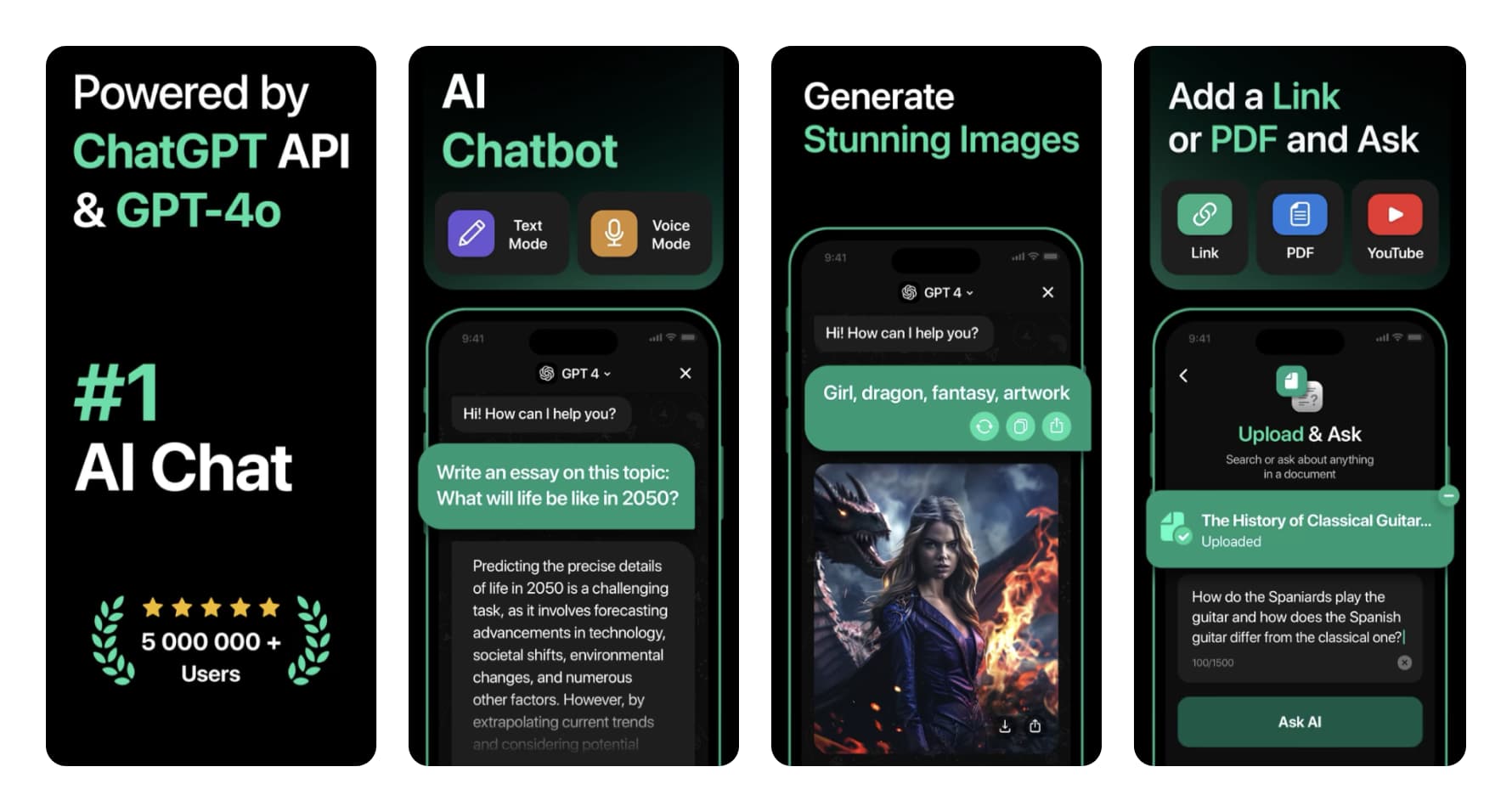
In the first three screenshots, highlight not only the “text to text” feature but also the “text to image generation” feature. Balancing these current design trends with unique visual strategies can help your app stand out and attract more users.
Source: the App Store and Google Play
Test the most standard layout for screenshots, featuring a single caption at the top and the UI displayed within the device frame for screenshots 2 and onwards. This familiar format simplifies information digestion for users, making it clear and structured, which can positively impact conversion rates.
