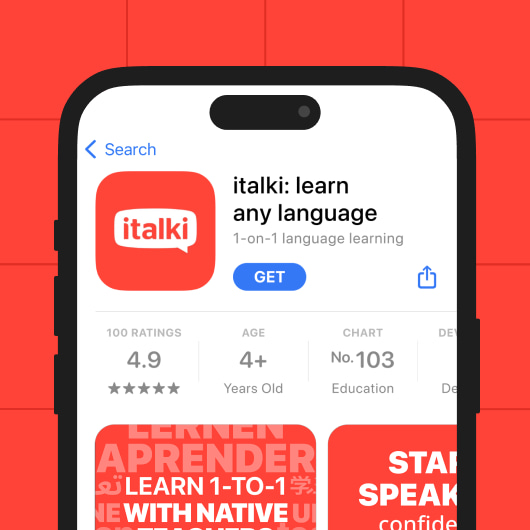
Screenshots are crucial elements on an app page, with the first screenshot being the most impactful for conversions. Most app installs occur after users view the first screenshot.
For the finance category, emphasizing security in screenshots is crucial for building user trust. Highlighting unique selling points and trust signals such as the number of downloads/security measures is an effective way to do it.
Source: the App Store and Google Play
You can use blue as the dominant color for your screenshots, as blue is associated with loyalty, stability, and confidence.
Source: the App Store and Google Play
Another way to build trust in potential users is to feature social proof on your screenshots, be it an app store rating, number of downloads, or an article in the media. Place this information on the first screenshot for maximum visibility.
Source: the App Store and Google Play
Frequently use A/B testing to refine your screenshots, focusing on security information and user benefits.

Since the finance category is very competitive, you can use bold colors for enhanced visibility. In this case, don’t forget to maintain adequate contrast for readability.
Source: the App Store and Google Play
Your screenshots should clearly demonstrate how your app makes investment, payment, and monitoring effortless. Highlight user-friendly features and showcase how your app simplifies financial tasks, reassuring users that it will make their lives easier.
Source: the App Store and Google Play
Showcase additional features in your screenshots. For example, illustrate how users can split the bill between friends or find subscriptions for apps they no longer use to avoid overpaying. These features should come after you demonstrate your key value proposition.
Source: the App Store and Google Play
While creativity is important, some evergreen rules for app screenshots should always be followed. Ensure your screenshots include a call-to-action, key information about the app, and proof of credibility.
