A well-designed, professional icon can make a strong first impression, and first impressions are everything for finance apps that strive to build a powerful brand — and a sense of security around it.
Avoid overloading the background with too many details, as clear, plain icons perform better.


Source: the App Store and Google Play
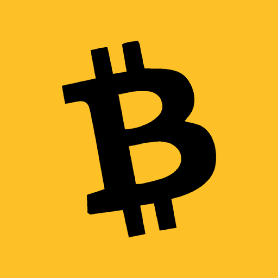
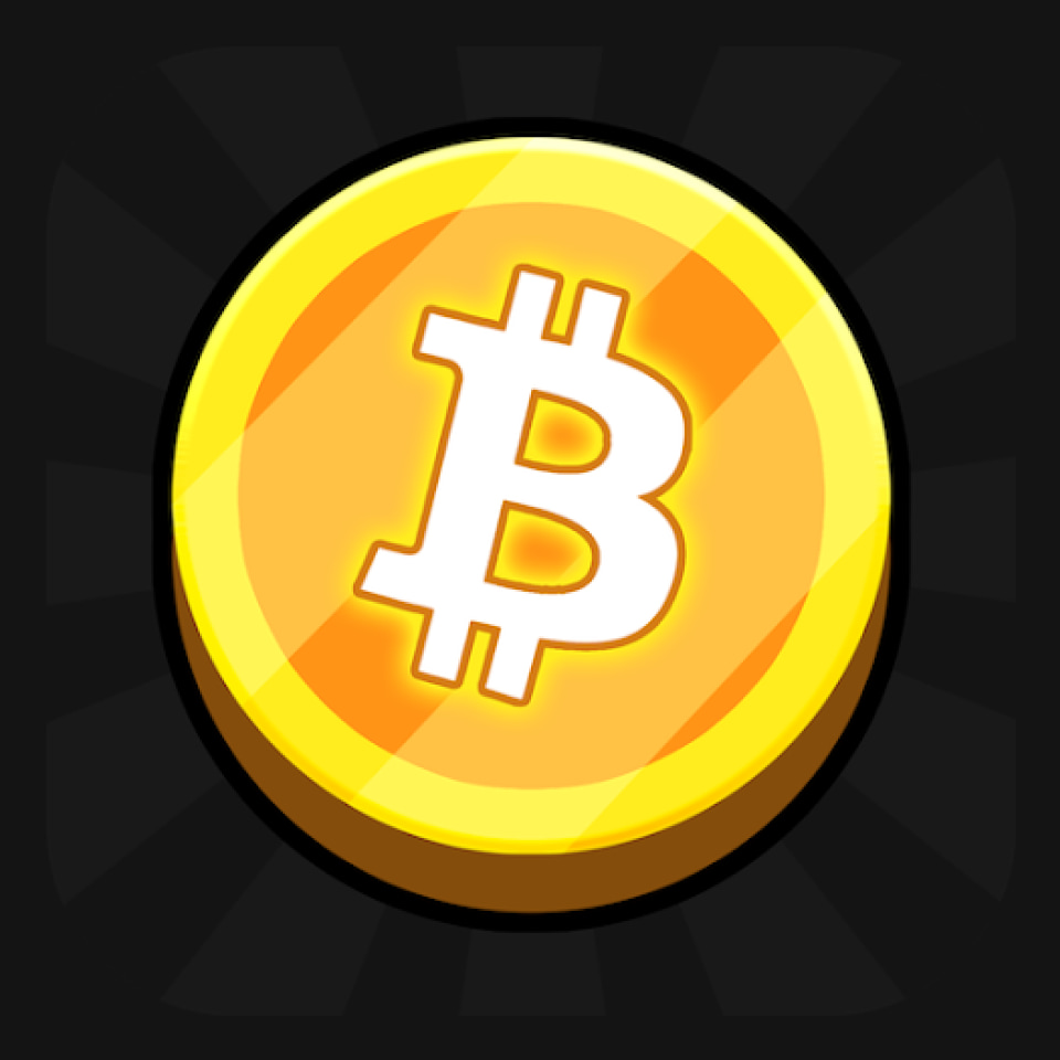
Using the first letter of the app name/cryptocurrency/bitcoin/other finance-related terms on the icon is still a big trend. A distinctive, stylish letter can be more memorable than a complex design, helping the app stay top-of-mind for users.


Source: the App Store and Google Play
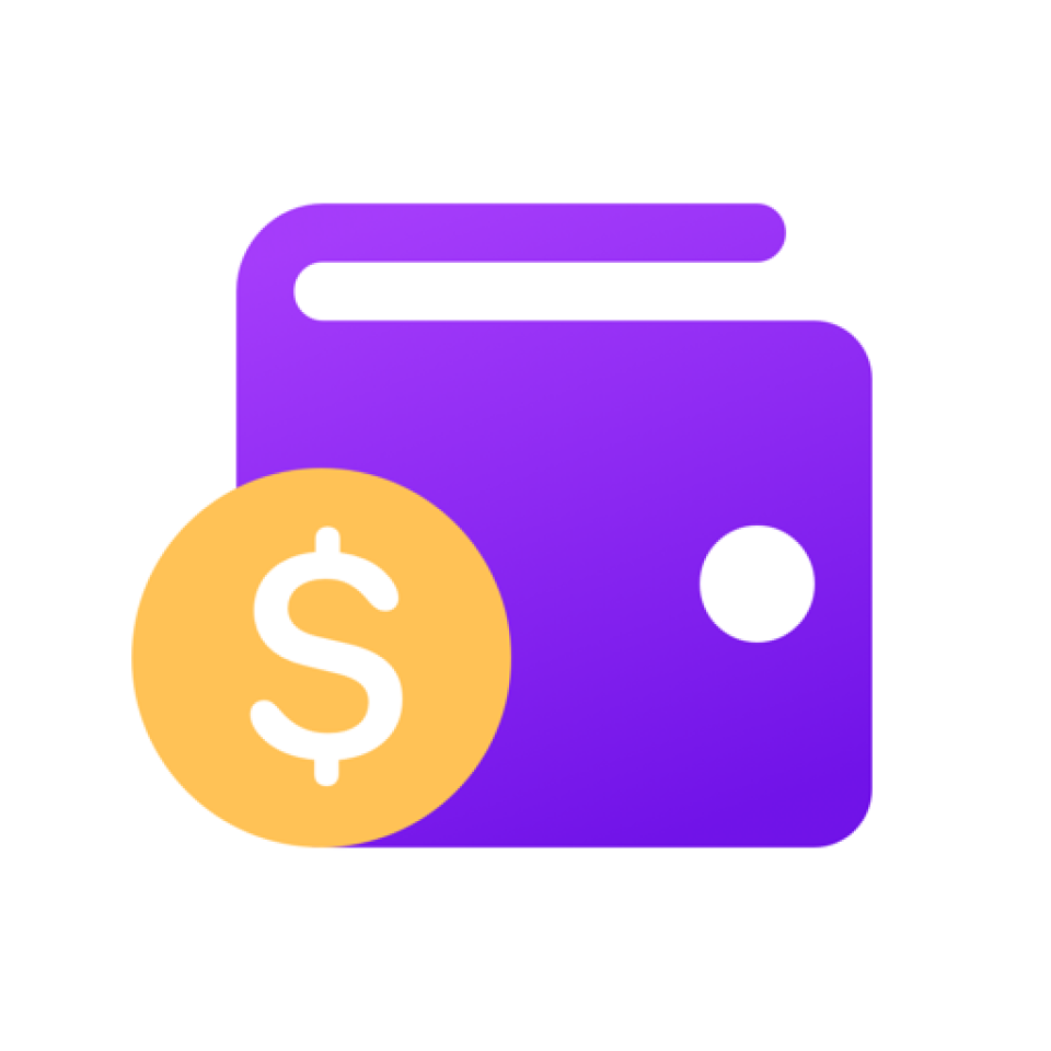
By using symbols such as the dollar/bitcoin sign or wallets, finance apps make it clear at a glance what their function is, encouraging more users to install them.


Source: the App Store and Google Play
Incorporating bold, vibrant colors into your app icon is a great strategy for enhancing visibility.
Select colors that stand out in app stores. They should contrast well with each other to make the icon pop and attract attention.


Source: the App Store and Google Play
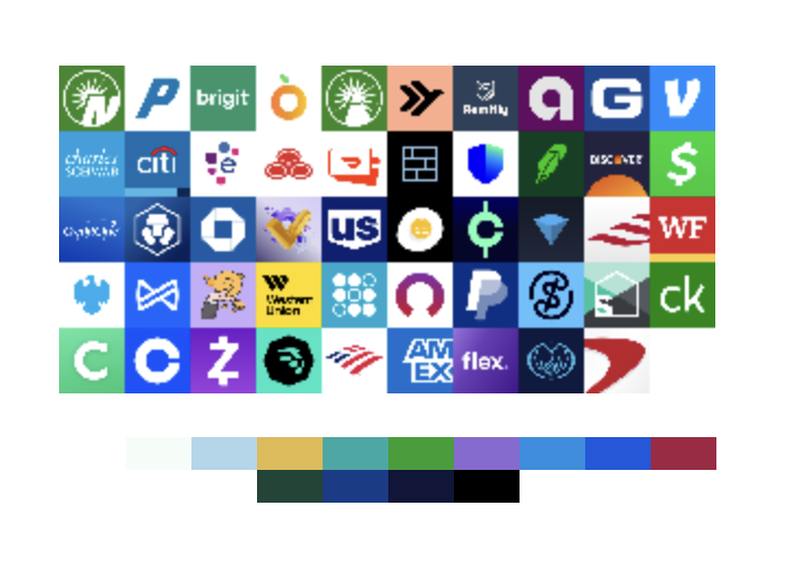
In general, the color palette of the category is pretty diverse. It’s obvious that app marketers don’t hesitate to try out different icon colors to get into the spotlight.
Finance apps deal with sensitive information and transactions. An icon that appears secure and trustworthy can reassure users that the app is safe to use. Elements like padlocks, shields, or secure colors (like blue, which is often associated with security) can enhance this perception.


Source: the App Store and Google Play
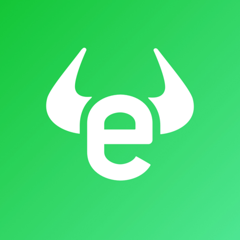
Investing apps actively utilize symbols typical for the stock exchange marketplace. Charts, bulls, and bears are popular picks.


Source: the App Store and Google Play
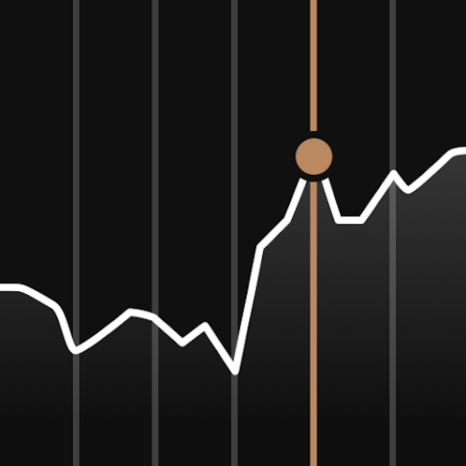
App marketers often use a clever trick when designing icons with financial charts or graphs. The chart always trends upward, symbolizing positive results achieved specifically with the app. This subtle design choice effectively communicates the app’s value proposition to users.
To grab attention, crypto and trading apps go for striking designs that aren’t typical for ‘classic’ finance apps. Icons may feature a mascot or meme-worthy character/personality. This is especially true for apps that aim at helping users learn the ropes of investing.


Source: the App Store and Google Play
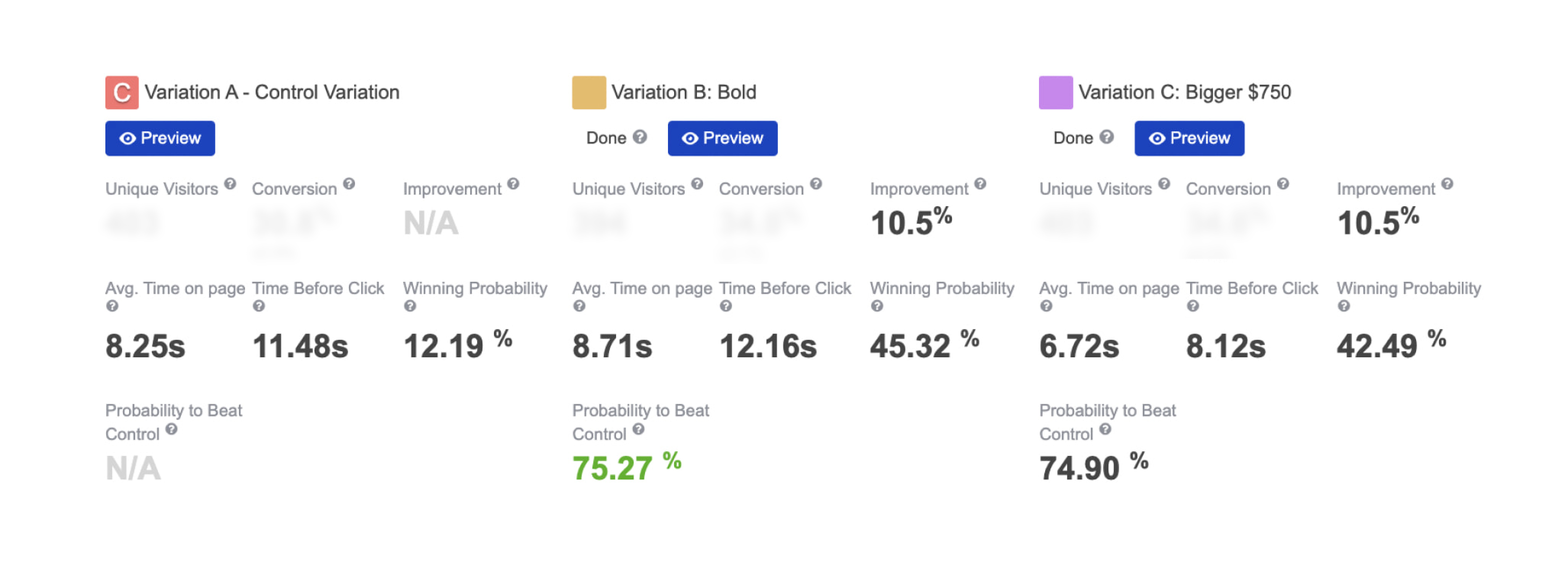
Your app icon has a greater impact on conversion rates when it appears in category listings and search results, as opposed to the product page where screenshots and videos play a more decisive role. Analyze the icon in the competitive environment along with other elements like screenshots and the app title.